Nothing is so personal as color. The selection of the color scheme is an extremely important and, at the same time, difficult task while decorating your home. We have prepared some tips for you in order to help to cope with the choice of the color scheme, which is the most suitable for your dwelling, individuality and way of life.
Contents [hide]
- 1 Types of Colors
- 2 Creation of Your Color Scheme
- 3 The Influence of Colors
- 4 Wall Decorations for Various Color Schemes
- 5 Black and White Color Scheme
- 6 Decor for Red Walls
- 7 Yellow Walls Decoration
- 8 Orange Room Décor
- 9 Décor for Pink Color Scheme
- 10 Violet Room Décor
- 11 Blue Color Scheme
- 12 Decorations for Green Walls
- 13 Brown Walls Décor
- 14 Décor for Rooms in Neutral Colors
Types of Colors
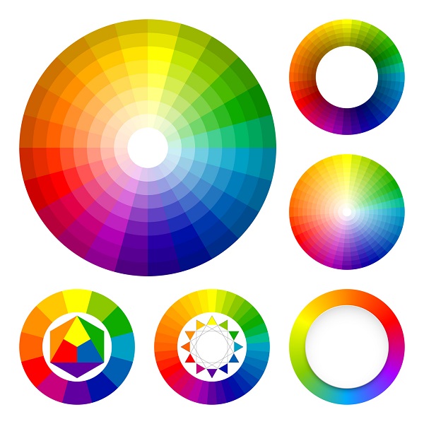
A Color Wheels Image
Start with considering the color wheel above. It includes primary, secondary and tertiary colors.
- Primary colors are red, blue and yellow. These colors are pure and they can’t be created by mixing of colors.
- Secondary colors are orange, green and violet. These colors are created by mixing of 2 primary colors in equal proportions. For example, the mix of blue and yellow in equal proportions gives green. And we start to choose the colors for interior decor from these basic colors.
- Tertiary colors are combinations of primary and secondary colors in different proportions for the creation of various hues. As a result, the primary and secondary colors become less bright. Usually, black or white colors are added to make the hue lighter or darker.
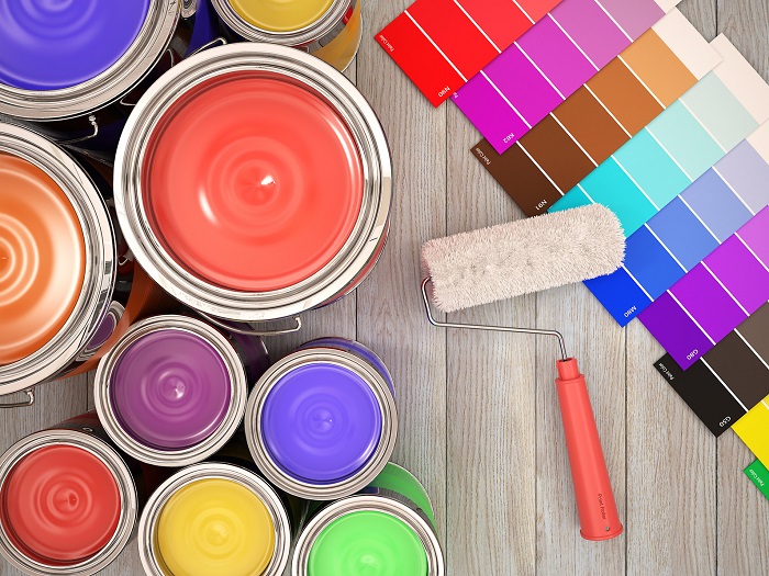
Creation of Your Color Scheme
A Samples of Paint Image
Use the color wheel to create your own color scheme, which is the most suitable for your individuality. There are four types of possible color schemes.
- Monochrome color scheme uses the hues of the same color with the application of black and white to lighten or darken the tinge. For instance, in this scheme, blue may turn into navy or celestial blue and in order to make such an effect, all three shades of the same tone are used.
- Analogous scheme uses neighboring colors from the color wheel. Thus, yellow will be used in combination with green or orange while blue will go with green or violet. In such a way, very colorful, but, at the same time, soothing color palette is created.
- Contrasty scheme is brighter. The triad of contrasting colors is applied here: yellow-orange, yellow-blue, red-violet. Such a scheme adds brightness and dynamics to the interior.
- Complementary color scheme uses two opposite colors, for example orange and blue, to create the bold and vigorous palette.
We recommend not to start the room decoration with choosing the color of the walls. Any color or hue of paint and wallpapers can be easily found while it’s rather difficult to find the matching furniture. As soon as you choose the furniture and decoration details, you can go on with choosing the wall color.
Probably, you will decide that brightness looks better not on walls but for accessories and small details. Many people prefer this method. On the other hand, some people think that the neutral details of the interior décor need to contrast with brightly colored walls.
The Influence of Colors
A Various Colors Poster
White color is associated with pureness and freshness. It reflects the sun beams, making the room lighter and expanding the space. It’s a good color for small rooms, where there isn’t much light. However, it’s demerit is that it gets easily soiled.
Black color can be used only in well-lit areas. Otherwise, you are risking to get a very gloomy room. If you like this color, designers recommend to combine it with mirror surfaces.
Gray is calm and neutral, but is a little bit dull. It’s not advisable to make it the major color of the room. However, light shades of gray may be a good background if you want to have some bright splashes on the wall or use colorful furniture.
Red is too active as a main color. It’s suitable for entryways, living rooms and kitchens. However, be careful with using it in baby rooms and bedrooms.
Yellow is a perfect variant if your room is facing the north. It stimulates the learning process and develops intellect. That’s why, it’s good for a baby room.
Orange is less active than red. This color contriburtes to better communication and harmonization of relationships. Use it in the places, where the family gathers more frequently, for example, in a living room design or kitchen.
Brown is a neutral color, but its light shades are better perceived. This color is good for furniture. It’s well combined with beige and peach colors.
Light blue helps to relax and feel comfortable. It’s ideal for bedrooms. It may visually expand the space and that’s why it’s frequently used in small rooms. Meanwhile, blue isn’t appropriate color for kitchen design as it reduces appetite.
Violet is the most mysterious color. It has many hues, which influence us in different ways. However, for a dwelling décor, it’s better to use its light shades as dark violet may tire.
Green has warm and cold hues and each of them creates different mood. It’s considered that green color helps to concentrate and it’s frequently used for the décor of working places and kids rooms. Some designers think that light green and pistachio colors are best for bedroom wall design
Wall Decorations for Various Color Schemes
When you have already decided what color scheme to use for your interior design, it’s time to start thinking of how to enhance the walls with decorations. Very often, posters are used for this purpose. Their pluses are that they aren’t expensive, but are available in many sizes and designs, can be applied in any type of interior and, of course, they are convenient in use.
Besides, the wall can be decorated with paintings. It looks very cool, though not everyone can afford them. It can be some art installations and even DIY things. The canvases are also a nice idea, as they are something medium between printed posters and paintings.
We’d like to provide you with the examples of how to choose the wall décor, suitable for a certain color scheme.
Black and White Color Scheme

A Black and White Horse Poster
Black and white décor is seldom interrupted by other colors. That’s why, while choosing the wall décor, you need to stick to the theme. Many designers like to use black and white photos for such interior. Abstract art posters in these colors are also among the favorites.
Mirrors and modern art installations look extremely cool on the black and white background. The glossy surfaces of the furniture are more preferable than matte ones.
Decor for Red Walls

A Red Rose Poster
Red is a very all-sufficient color. If you choose this color for painting the walls, you need to decorate the rest of the room with much care. It’s better not to add any other bright color to the décor and consider the wall art in warm and relaxing colors. Black and white and sepia posters will be suitable for such walls.
Or, if you don’t want to choose the wall art in relaxing colors, choose the one in red. If you have smooth walls, choose the prints with vivid and textured images. Though the color is the same, the picture will stand out by its pattern.
Yellow Walls Decoration

An Autumn Forest Poster
The choice of wall art for yellow walls depends upon the shade. Light yellow is rather a neutral color and many prints and paintings may be used for decoration.
If the walls are bright yellow, it’s good to combine them with black, gray or brown to harmonize the space. The photo posters may be used here, for example the one of an autumn forest. The black and white art also looks great.
Orange Room Décor

A Sunrise Poster
Orange walls are very bright. Though many people say that it’s not good to make all the walls in the room orange, there are personalities, who do that. However, if you like orange, it’s better to combine it with more neutral colors like light yellow, beige or peach. Or, vice versa, add a bit of darkness and choose the navy blue wall art.
Décor for Pink Color Scheme
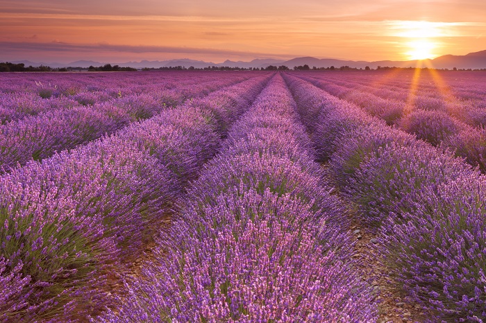
A Lavender Field Poster
As a rule, pink color is used for the design of a baby girl room or bedroom. The images of pink flowers look very organic in such a design. In a baby room, you may decorate the walls with the posters or stickers, featuring various fairies, princesses or cartoon personages.
Pink color is well-combined with light green, purple, brown and violet. Thus, if you want to get rid of the “total pink look”, try to add these colors to the interior.
Violet Room Décor
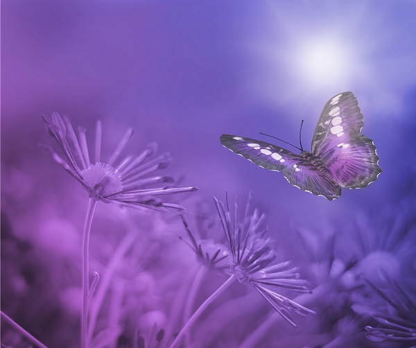
A Violet Butterfly Poster
Though it’s considered that light shades of violet are more preferable for wall decoration, you are free to have your own opinion. Very often, dark shades of violet look extremely cool and mysterious.
A nice idea is to combine various shades of violet, from the lightest to the darkest ones. If you have light walls, seek for the poster or painting, which is made in dark colors and vice versa. You are free to use several hues of violet simultaneously and not only two.
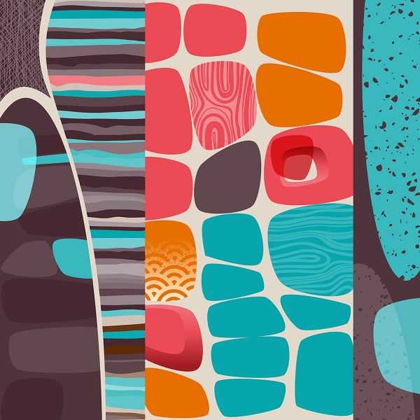
Blue Color Scheme
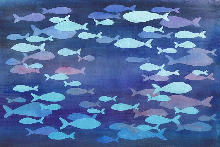
An Abstract Fish Poster
There are so many shades of blue that it’s hard to find an image, which will suit any hue. The colors, which look cool with the celestial blue, aren’t always well-combined with navy or bright blue colors.
However, the majority of blue hues can be nicely complemented by the shades of violet and pink colors. A classical combination is blue and white. Or, while choosing wall art, you may seek for the posters, featuring various shades of blue. Such a picture will suit many kinds of designs in the blue color scheme.
Decorations for Green Walls
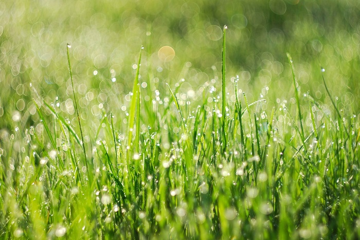
A Green Grass Poster
It may sound a bit strange but green is best of all combined with green. If you have light green walls, choose the wall art in bright or dark green hues. For instance, it can be a poster of grass or a close-up photo of a leaf.
The use of flowery prints is also appropriate for green design. The images of flowers of any type and color may be used. Moreover, the colors, which resemble the nature, are a good choice as well.
Brown Walls Décor
An Abstract Art Poster for Brown Walls
While light shades of brown are considered to be neutral and are used both independently and in combinations, dark brown is seldom used independently. It’s rather dark and by painting all the walls in this color, you will make your dwelling rather gloomy.
It’s good to combine brown with bright colors or neutral ones. The combination of brown and beige is classy. If you want to have something more interesting, think about complementing brown designs with turquoise, yellow, orange or pink wall decorations.
Décor for Rooms in Neutral Colors
An Art Poster for Neutral Walls
The neutral wall colors are white, beige, light shades of brown and gray as well as many hues of them. The major plus of having such walls is that you can choose any color for furniture and wall art.
If you want to decorate the walls with posters or paintings, you have almost no limits in color as even the craziest combinations of colors on the image will be ok for the room with neutral walls. However, don’t forget about the stylistics and select the wall art, which suits the style and theme of the whole room.
The process of choosing the color for your dwelling must be pleasant and not stressfull. Don’t hurry. Go to the shop, take some samples of paints home and try to imagine what color is the best for you. Remember that it’s not necessary to follow all the rules and recommendations. Listen to your heart, trust your instincts – they never lie!
The same concerns the selection of wall decorations. Of course, you need to choose the wall art, which is in harmony with the rest of the room and complements the general design. However, it’s also important that you like it and it inspires you. That’s why, never hang the paintings, canvases, posters and other kinds of wall decorations, which you don’t like.
Leave a Reply